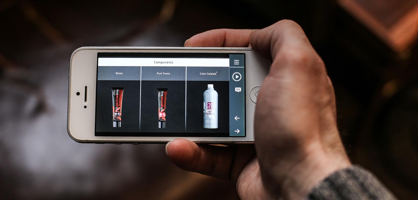
Mobile First Product Training
Executive Summary
Aveda Education needed to transform their Hair Color Systems instructor-led product training for colorists into assets that could be used both on a standard computer and mobile devices, with a primary focus of mobile-first. The instructor-led training consisted of an eight-hour in-person course with PowerPoint presentations and handouts.
The colorist audience did not consist of Aveda employees, but independent colorists who chose to use the Aveda hair color product line. Therefore, the training was not required, but was a helpful resource for them to learn how to use the products. Providing access to this training would drive adoption of Aveda Hair Color products.
Aveda trainers needed to travel to deliver this training, making the endeavor quite costly.
For the training to be successful, it needed to be accessible at any time and in any location. The idea was that the training could be taken while in the break room at the salon, in between customers, or maybe on their way to work on the public transportation. The training also needed to be in small enough pieces that it could be taken on 15-minute breaks.

Challenges
The biggest challenge was designing a solution that would both teach colorists what they needed to know and then allow them to practice. During the instructor-led training, colorists would refer to a complex and confusing color chart that showed the various product lines and their components: base, color, and color catalyst. The instructions included in the instructor-led training were not given in a consistent manner for different product lines, even though the steps were similar.
A colorist new to the chart might find learning this material overwhelming. Each of our modules covered one product line and broke down how to use the chart for the desired color. Every module would reference back to the chart to show where the formula, product components, and steps could be found. Creating a video in AfterEffects and embedding it into the Storyline module allowed us to animate the chart to zoom in and out on the relevant sections, hover, and turn pages as necessary.
We then created practice scenarios for each of the product lines. In the scenarios, a customer would request a certain shade, sometimes from a picture, and the colorist would need to determine how many shades lighter or darker the hair needed to be, which products to use, and which steps to take to mix and apply them. The navigation experience was made to be versatile so that learners could jump ahead or re-watch sections as needed.
The second challenge was to creative a seamless visual design, even though each of the Aveda products had its own sub-brand under the Aveda brand. We wanted to be sure each learner understood that the training was a unified series, but the series still called out the characteristics of each sub-brand.
In order to further unify the course, and to ensure all colorists were grounded in the same framework, we designed and developed a separate module on Color Theory to precede the product line modules, where learners would refresh training they received in cosmetology school on how colors impact each other and how hair products impact the hair follicle. In all, the total curriculum was shorted to one hour and twenty minutes from the initial eight-hour instructor-led training.
Finally, in order to gain buy-in from the colorist audience, we designed and developed a short explainer video on the curriculum that previewed some of the mobile learning examples, with the general message that if the colorists would complete these courses they would be comfortable and successful using the product lines.
Our Solution
Given the business goal of reducing costs and required resources attached to the current instructor-led training being done by the Aveda team—and the goal of introducing enhanced and more mobile-friendly training—Dashe proposed the following course outline:
- One Two-Minute Explainer Video
- Introduce the four main product lines, describing differentiation from competing products
- Define overall mission
- One 5 minute Color Theory eLearning Module
- Four 8-10 minute eLearning Modules on Product Lines
- Each module will introduce the uses for the line and describe differentiators
- Cover product components
- Cover the services
- One Seven-Minute Put-It-All-Together Activity Module
We designed the solution using the concept of Mobile First, where the smallest screen (a smartphone) was designed for first. Articulate Storyline 360 was utilized to create a course that would scale beautifully and consistently across devices. In addition to the design being visually appealing, all clickable interactions and functionality needed to be user-friendly on the small screen size.
See the project here:
Committed to
finding solutions
